Logo Rationale
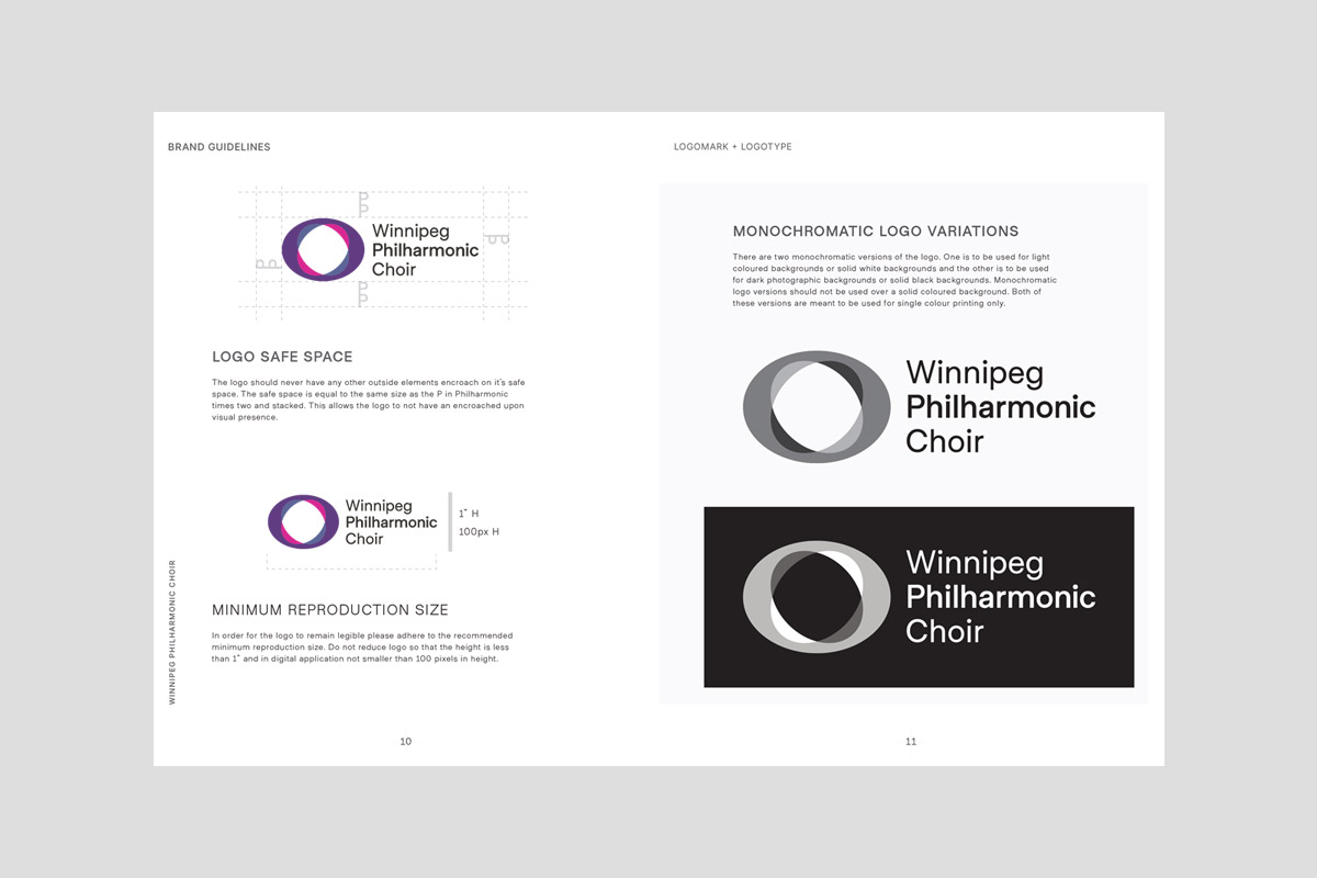
At the core of this reimagining is the new logo, a symbol designed to embrace all individuals and embody the Phil’s distinguished reputation for choral excellence. The logo, crafted as two overlapping whole notes converging into one harmonious sound, serves as a visual ode to unity and collaboration. A clever play on the double whole note, or Breve, pays homage to The Phil’s century-long legacy of musical brilliance.
Colour Palette
This colour palette is designed to honor the choir’s rich history, capture its creative and vibrant musical spirit, and convey a sense of professionalism and trust in its performances.
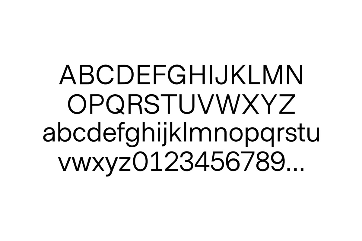
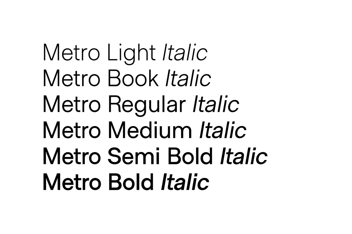
Primary Typeface: Metro Sans
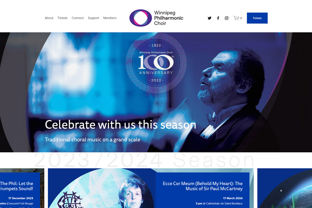
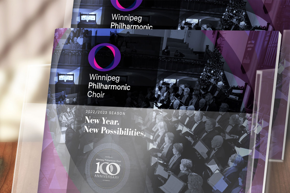
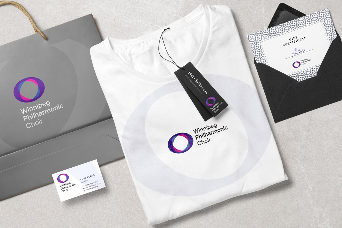
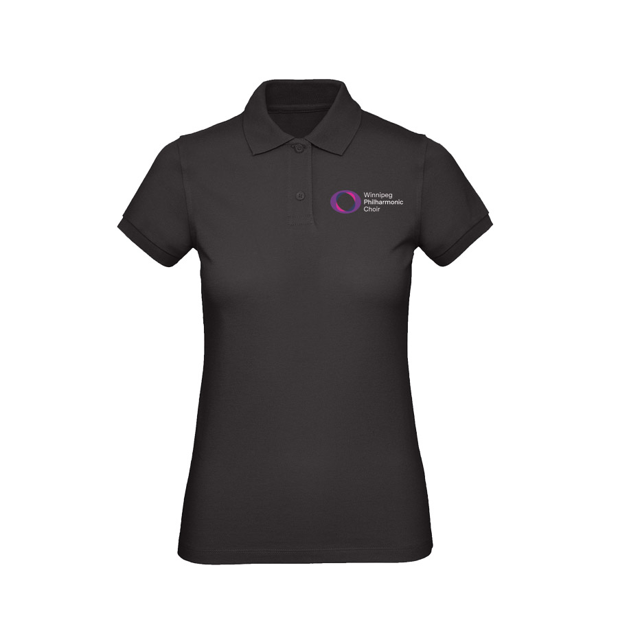
Metro Sans was chosen as the primary brand typeface, chosen for its legibility at various sizes, and modern aesthetic that seamlessly aligns with the energy of the logo mark. This comprehensive redesign extends beyond the logo to encompass a cohesive typeface, a dynamic color palette, versatile merchandise, impactful marketing materials, distinctive signage, a user-friendly website, and a suite of supporting digital assets. Join us in celebrating this harmonious fusion of tradition and modernity in the Winnipeg Philharmonic Choir’s new brand identity.


