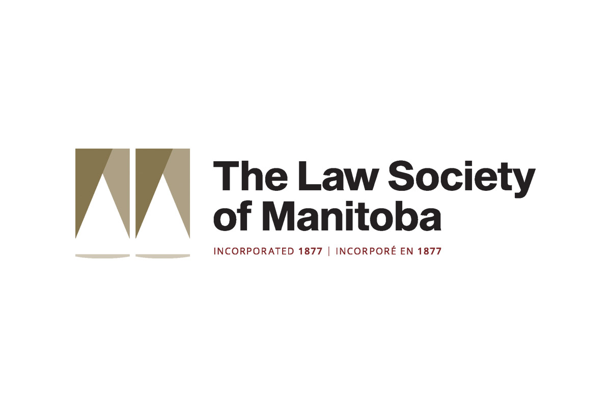
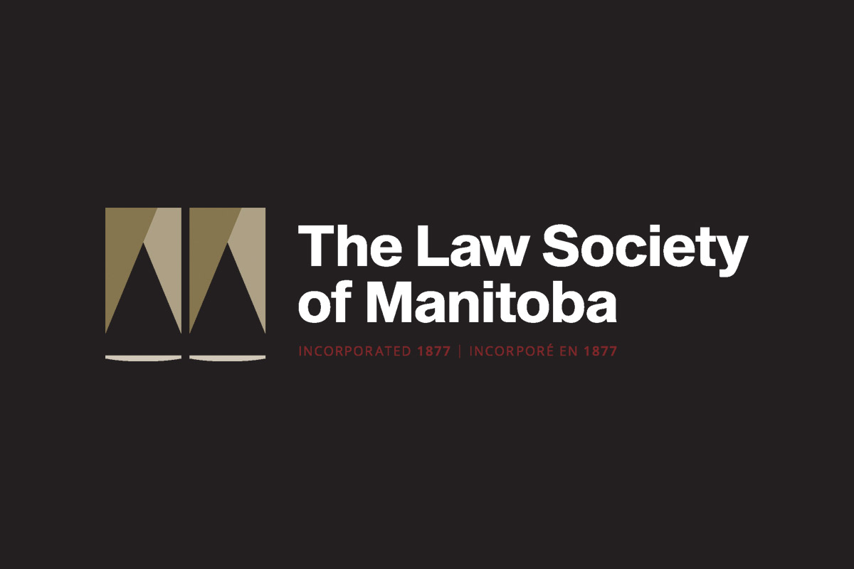
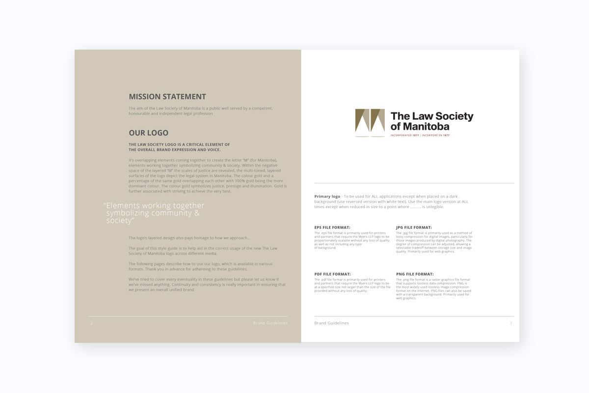
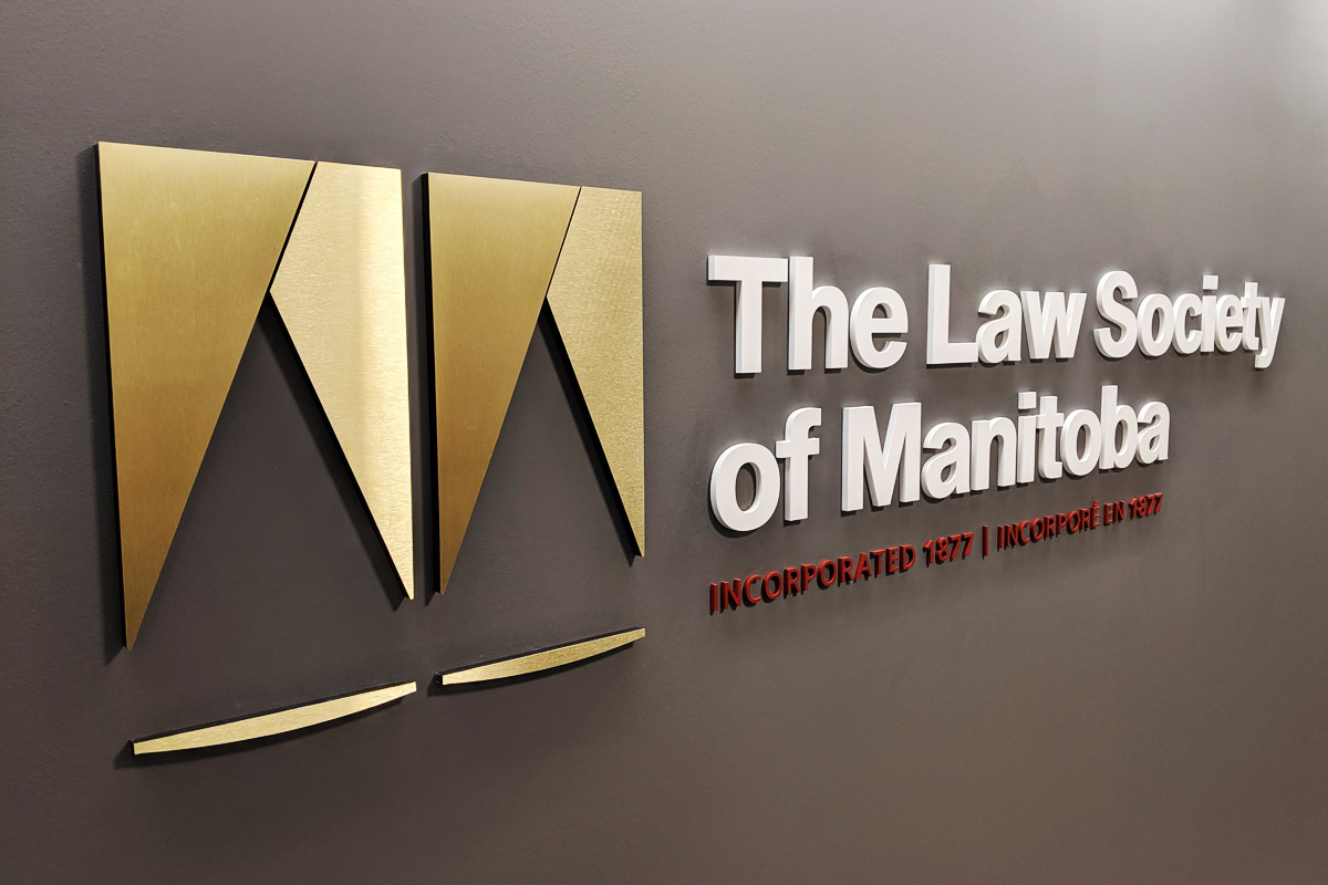
Logo Rationale
The Law Society of Manitoba’s logo is more than a visual mark; it is a nuanced representation of the organization’s core values and its symbiotic relationship with the Manitoba community. The overlapping elements form the letter “M” for Manitoba, symbolizing unity and collaboration within society. In the negative space of this layered “M,” the scales of justice subtly emerge, emphasizing the Society’s commitment to fairness. The multi-toned, layered surfaces of the logo depict the legal profession’s complexity and its interconnectedness with the diverse public it serves. The choice of gold, with its rich symbolism of prestige, illumination, and justice, elevates the logo to embody the Society’s dedication to upholding the highest standards.
Colour Palette
This carefully curated palette speaks to the Law Society’s ethos, harmonizing tradition with contemporary vibrancy.
Primary Typeface: Sequel Sans
Sequel Sans is more than a typeface; it’s an homage to the legacy of Max Bill, a mid-century Swiss polymath. Sequel Sans has been meticulously designed to encapsulate the essence of modernism. Its simple yet purposeful shapes resonate with the directness and clarity expected in the legal profession. Whether used for large headlines or small body copy, Sequel Sans exudes attention to detail, making it an ideal choice to represent the Law Society’s commitment to precision, professionalism, and modern aesthetic.