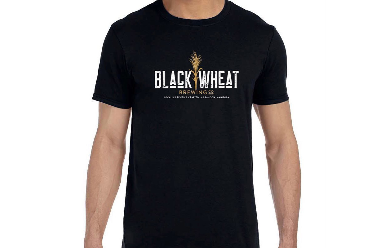
Crafting the Identity: Logo Rationale
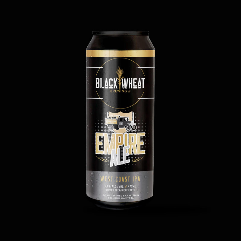
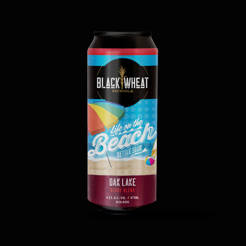
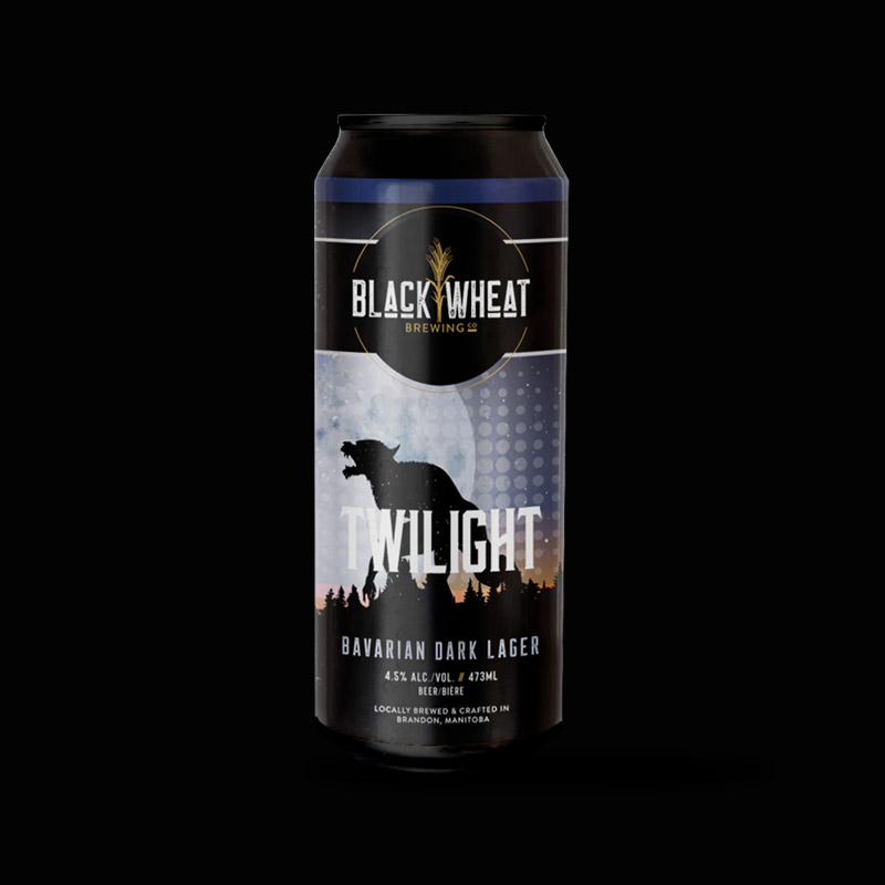
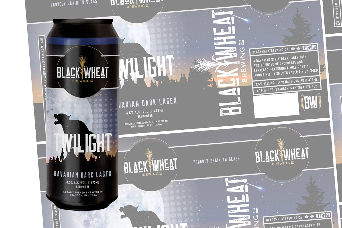
Logo: The heartbeat of Black Wheat Brewing’s identity lies in its distinctive logo. Crafted with an iconic type, the logo boasts a single stalk of wheat gracefully bridging the words “Black” and “Wheat.” This visual centerpiece not only signifies the essence of the brewery’s name but also stands as a symbol of the craft, connecting tradition with a contemporary aesthetic.
Typeface: We meticulously selected a typeface that not only ensures clarity but adds character to the brand. The chosen font aligns seamlessly with the overall design, enhancing the visual appeal while maintaining the legibility essential for effective branding.

Colour Palette
This colour palette is crafted to symbolize the richness of the brewing tradition and anchor it with a sense of sophistication and depth. Together, these colors contribute to a visually appealing and meaningful representation of Black Wheat Brewery’s brand identity.
Designing the Experience
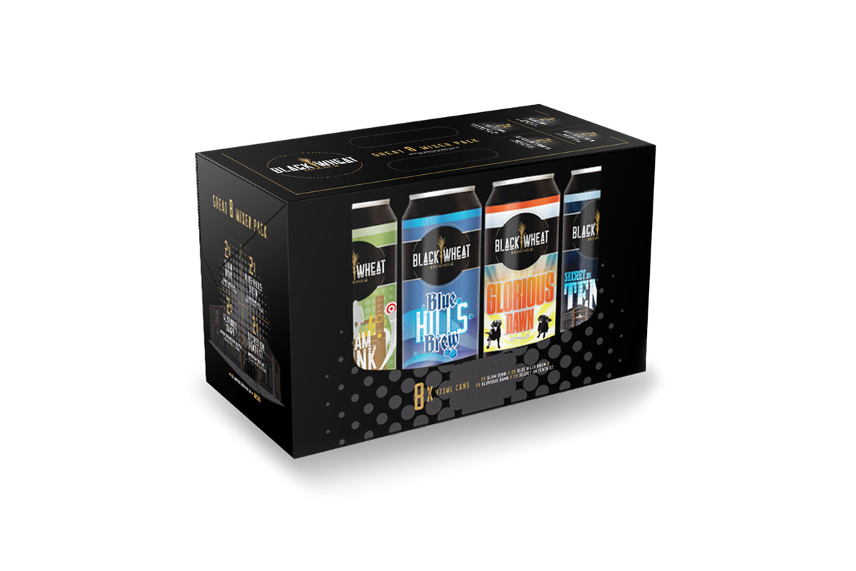
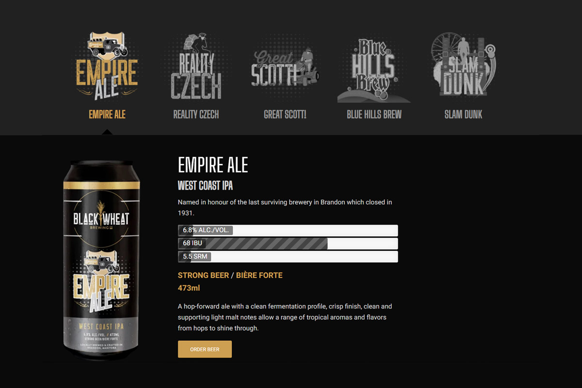
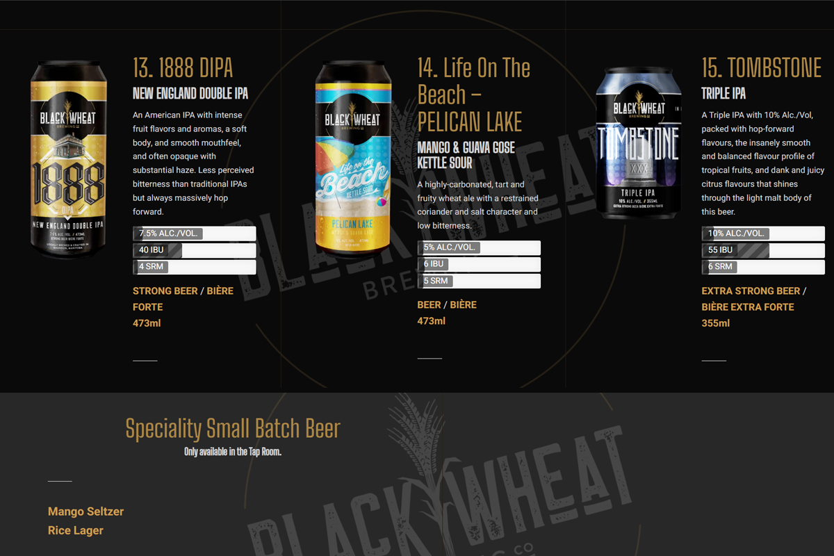
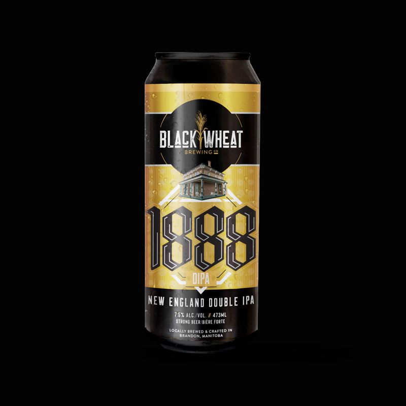
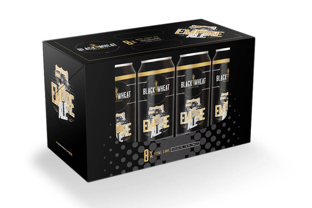
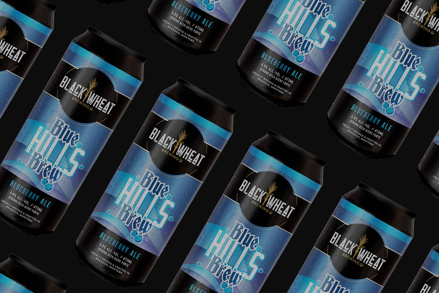
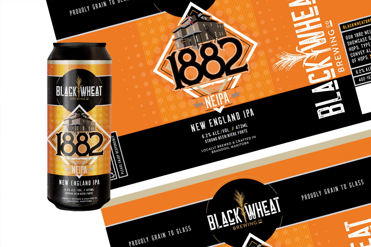
Beer Can and Label Design: Our approach to beer can and label design goes beyond aesthetics; it encapsulates an unfolding narrative with every sip. The incorporation of the wheat stalk motif ensures a cohesive visual language across all brews, creating a recognizable and captivating brand presence on the shelf.
Marketing Material: From brochures to promotional content, our marketing materials echo the brewery’s visual language, ensuring consistency and brand recall in every piece of collateral.
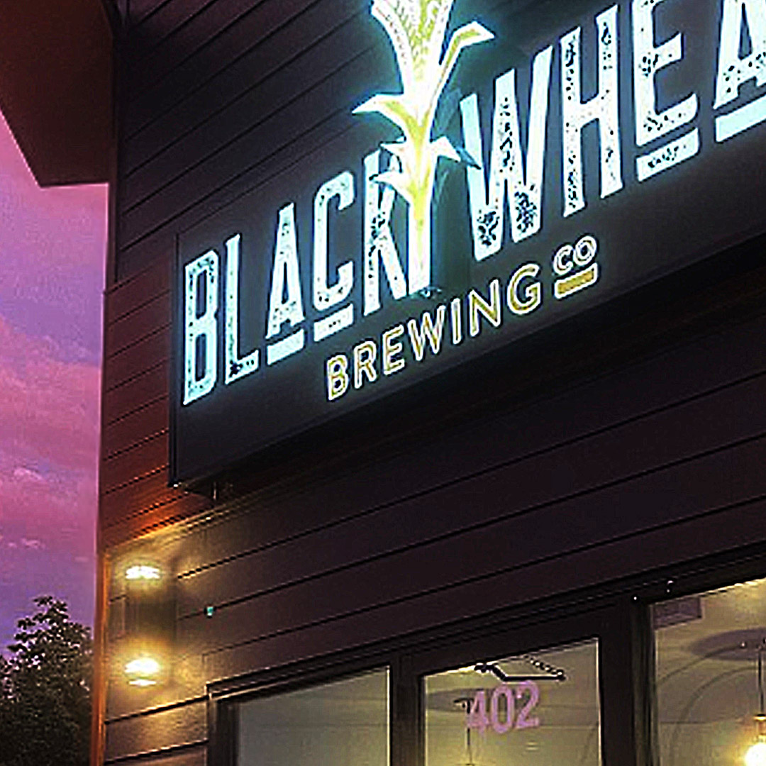
Signage: Our signage design for the taproom is a natural extension of the overall identity, ensuring that Black Wheat Brewing stands out not just within the taproom but in the broader community of Brandon.
Website: The digital realm is a vital touchpoint for any modern brand. Black Wheat Brewing’s website seamlessly integrates the crafted visual identity, offering an immersive online experience that mirrors the warmth and authenticity of the physical taproom. It showcases the various beers that are available throughout the seasons.
Digital Assets: Supporting Black Wheat Brewing’s digital footprint, our suite of digital assets ensures a unified and compelling representation across various online platforms.