Logo Rationale
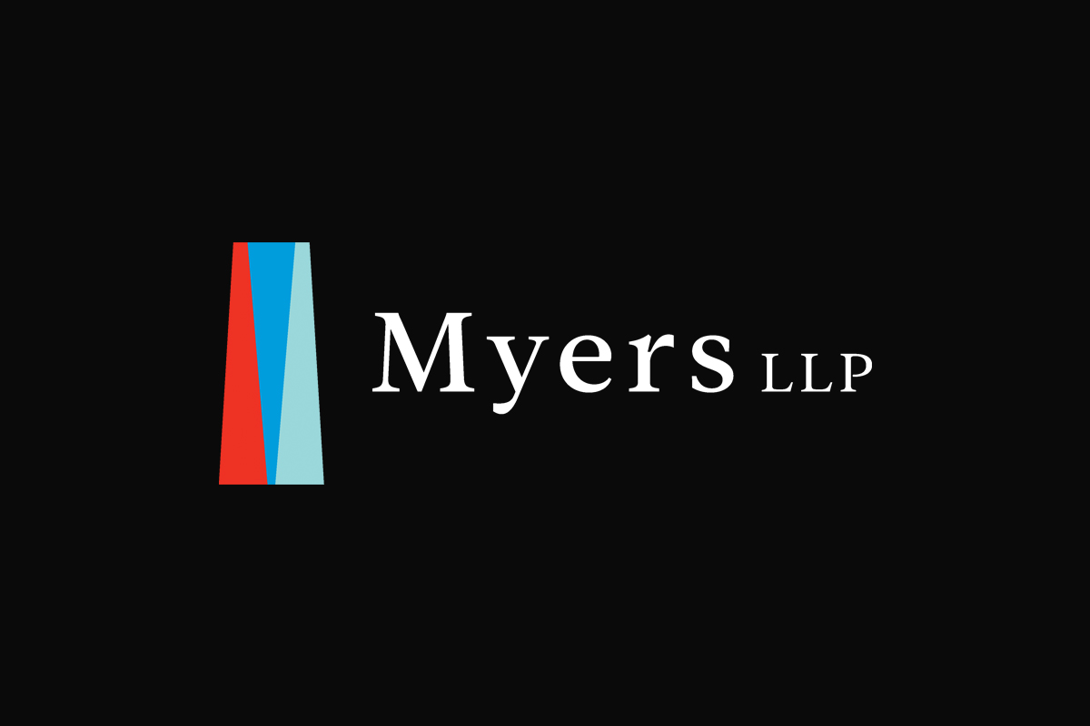
Logo: The redesigned Myers LLP logo harnesses architectural columns’ potent symbolism to reflect the legal profession’s core values. It features three geometric columns that converge into a singular, cohesive structure, subtly forming the letter ‘M.’ This unity of geometric shapes not only signifies strength but also embodies the firm’s collaborative ethos. The interplay of these elements represents the collective foundation upon which their firm is built, signifying a blend of resilience, teamwork, and durability.
Typeface: For the typeface, we chose Addington CF for its clarity and distinguished presence, echoing the architectural themes of its logo. Addington CF, with its strong serifs and clear, readable design, complements the structural motif, mirroring the precision and authority crucial in the legal field. Its modern yet timeless appeal ensures that its brand communicates reliability and professionalism, essential traits that resonate with its clientele. This selection supports their visual identity’s goal: to be accessible yet authoritative, bridging traditional values with contemporary practice.
Logo Colours
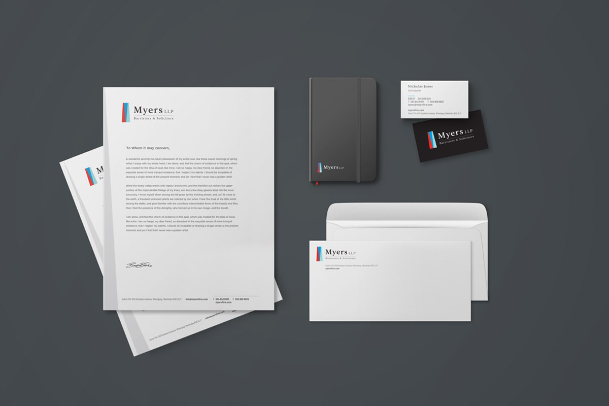
The colour palette has been carefully chosen to represent the firm’s dynamic and dependable nature, aligning with their clients’ expectations and the firm’s core values.
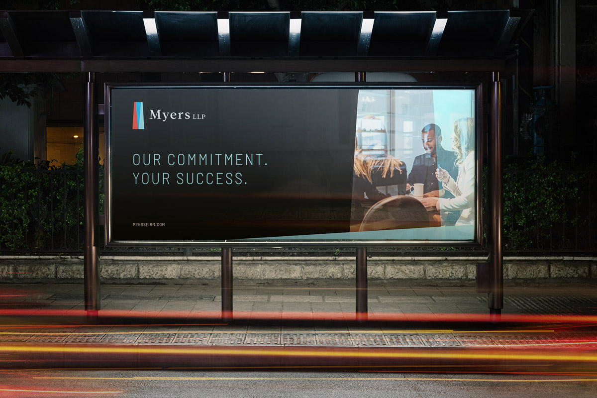
Overall Color Strategy: The combination of these colours not only provides a visually appealing and distinct identity but also carries deep symbolic meaning aligned with Myers LLP’s values and client-centric approach. The contrast between the vibrant red and the calming blues creates a dynamic and balanced visual identity, mirroring the firm’s blend of vigorous advocacy and thoughtful counsel.
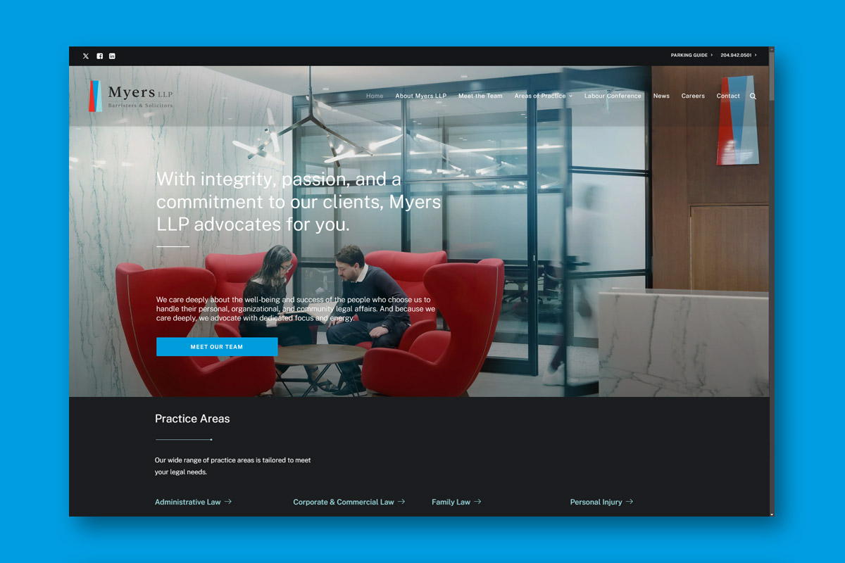
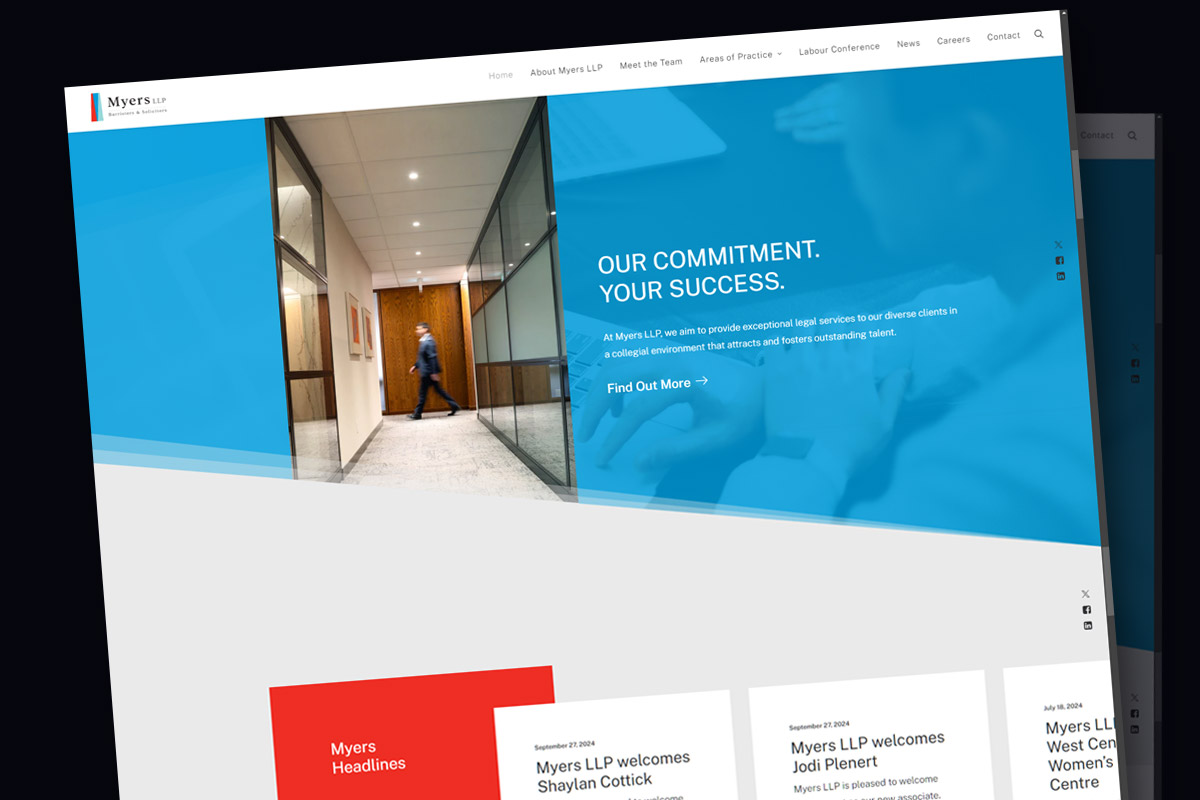
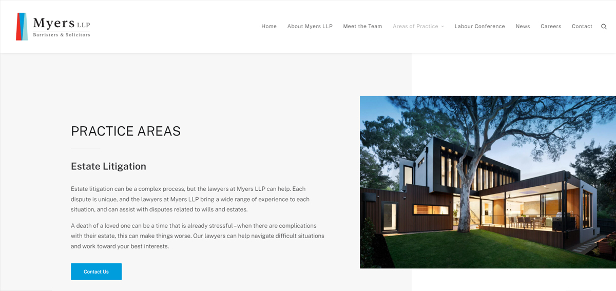
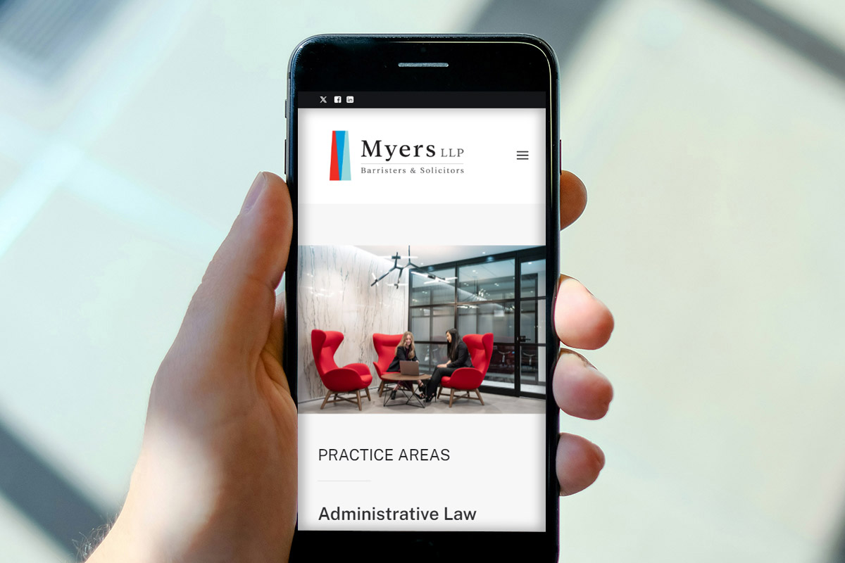
Website
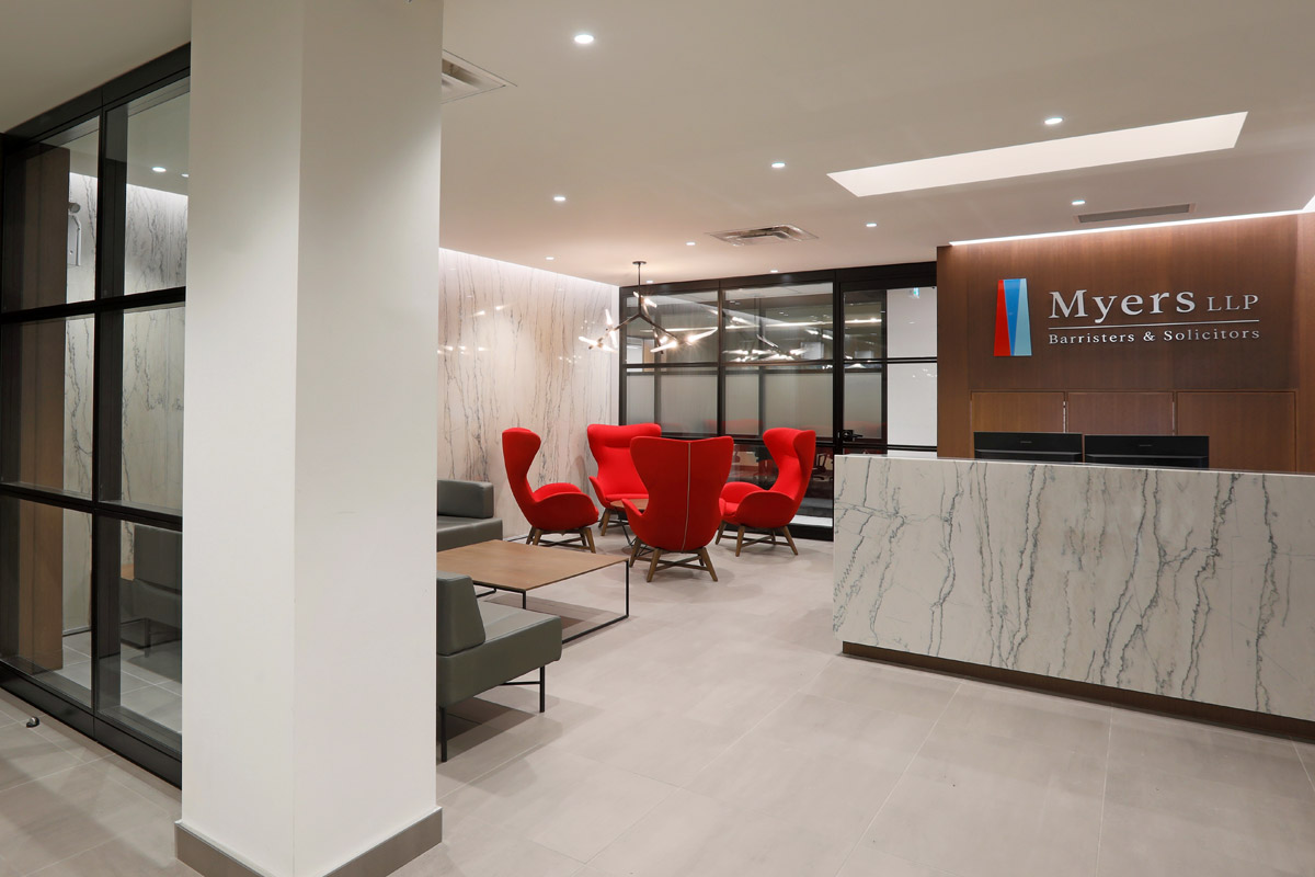
Smokehouse Design Co. developed a website built around the new Myers brand identity. The new website highlights the law firm’s people-focused approach within its core but also extends outward to its clients. Custom photography and planning at every stage throughout the development process, Smokehouse has developed a new engaging online presence that helps Myers LLP stand apart in the legal landscape.