Crafting the Wordmark
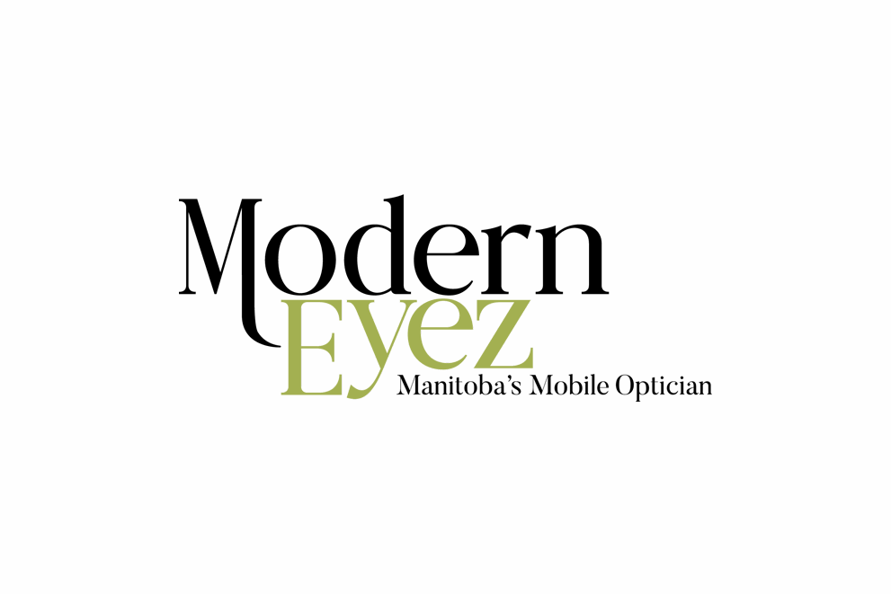
The Modern Eyez logo is a clean, type-only design that balances simplicity with subtle symbolism. The descending arm flows directly into the word “Eyez”, echoing the arm of an eyewear frame and guiding the eye into the name itself. This detail adds a quiet sophistication to the mark, reinforcing the brand’s connection to both style and vision care. The soft green color integrated into the “Eyez” portion of the logo evokes calm, clarity, and approachability. All qualities are central to the Modern Eyez experience.
Typeface: A bold and modern serif font that seamlessly blends contemporary sophistication with a touch of industrial elegance. The subtle balance between structured letterforms enhances both readability and visual impact, offering a unique combination of strength and elegance.
Our Approach
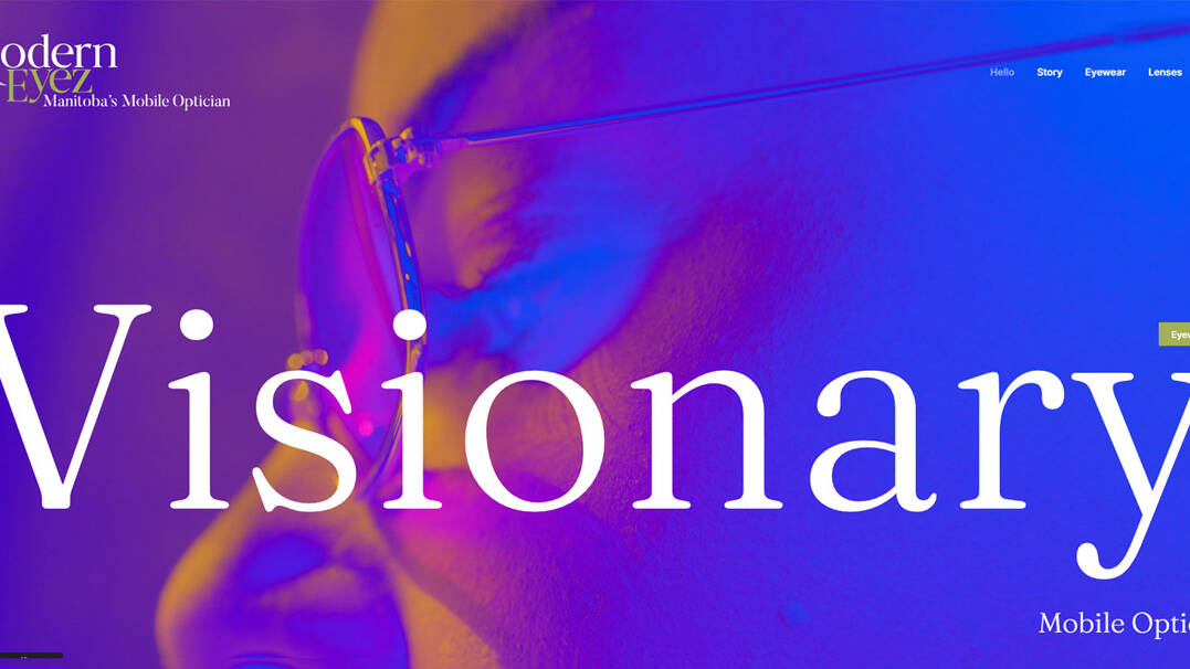
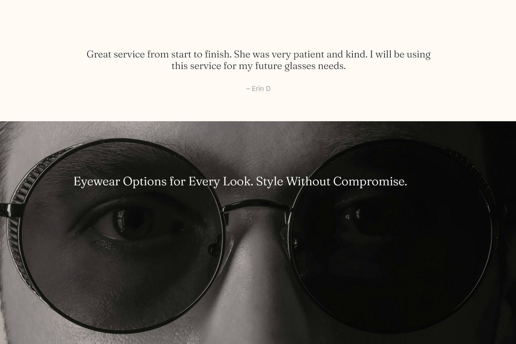
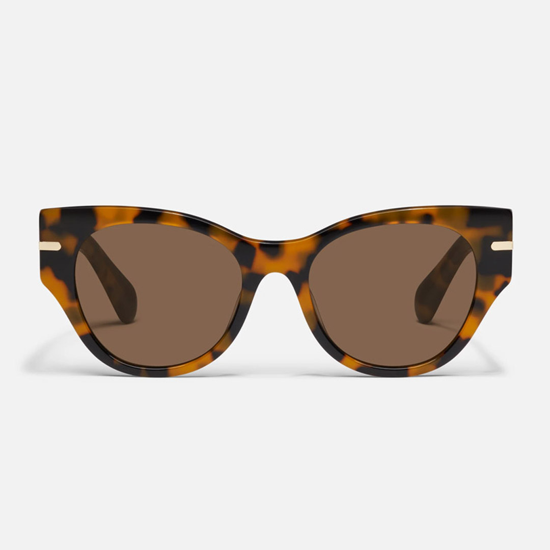
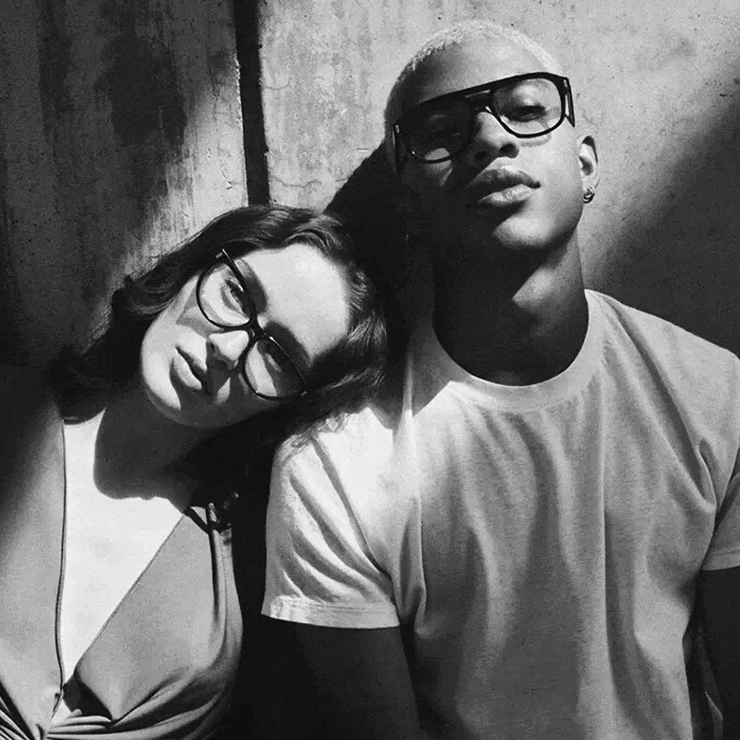
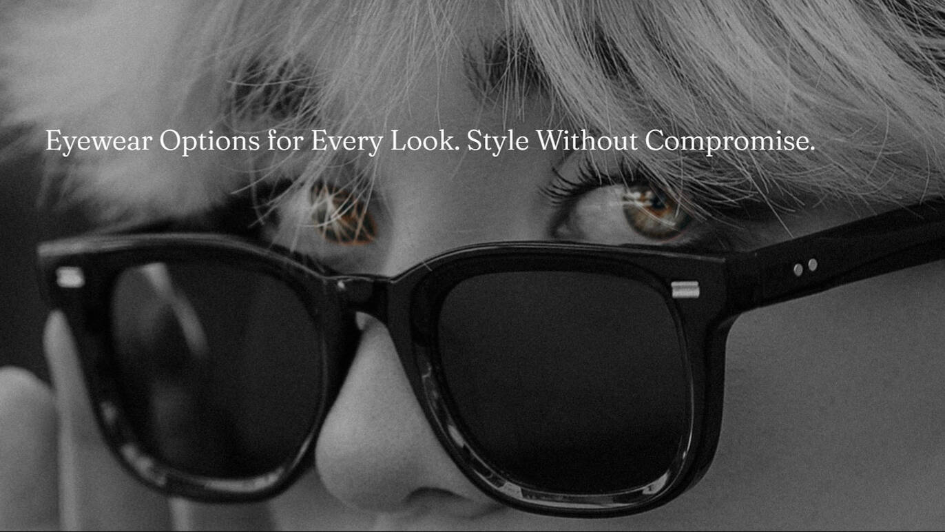
We focused on a Clean, modern layout, bold colours, and sharp imagery of frames and lenses help create an inviting first impression that feels both modern and trustworthy.
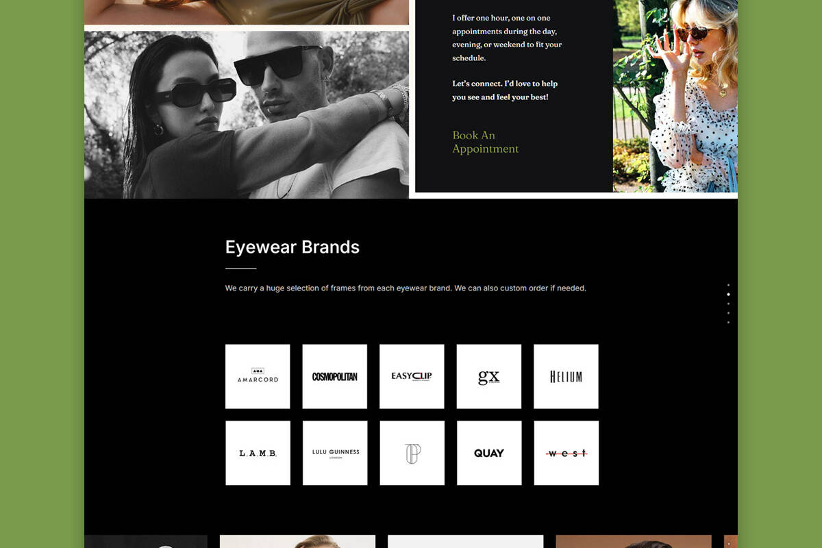
Easy Browsing: We built intuitive navigation so visitors can easily explore services, browse frames, and frame brands, as well as understand how the Modern Eyez mobile service works.
The Results: The launch of the new Modern Eyez website has boosted online visibility and made it easy for customers to discover and book mobile eyewear appointments. The clear design, strong mobile experience, and easy navigation have all contributed to more inquiries and bookings, plus great feedback from first-time visitors looking for eyewear at home service.


