The Identity
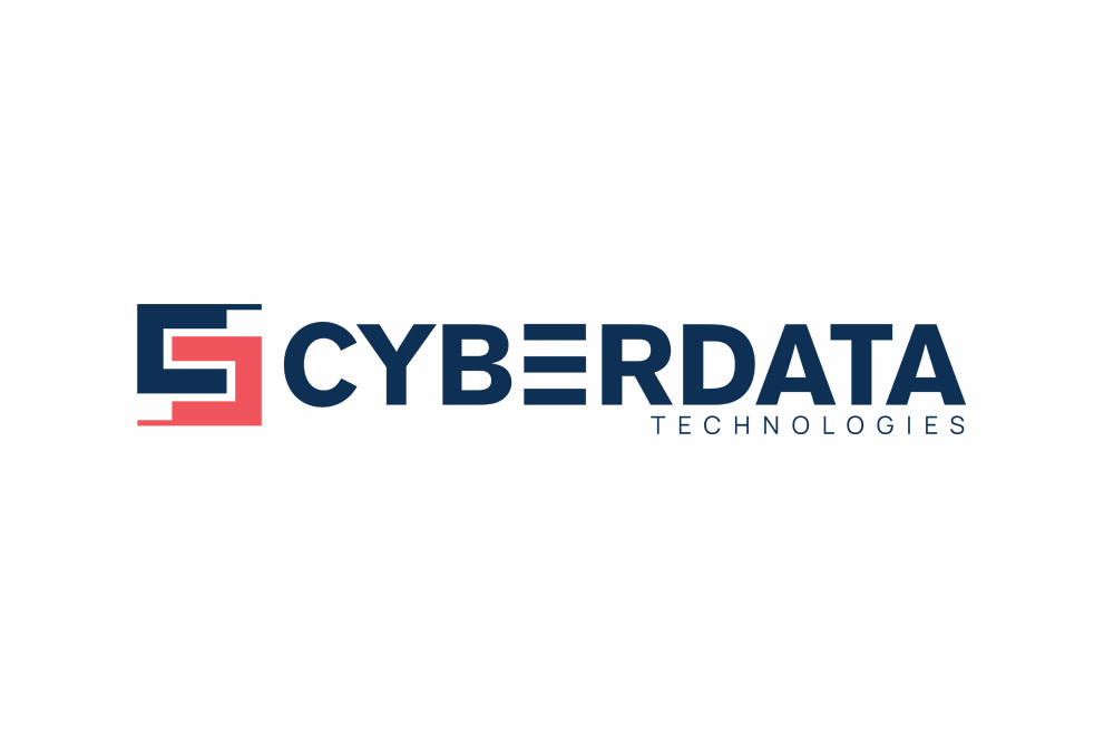
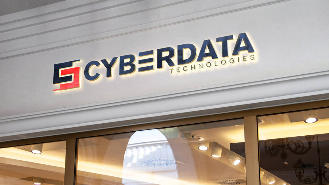
This logo brings together the letters C for Cyber and D for Data in a way that feels connected and intentional. The design reflects how these two elements work hand in hand: interconnected, networked, and seamlessly integrated while symbolizing the constant flow of information from one system to another. It is about more than just letters; it is a visual nod to how technology should feel: cohesive, intuitive, secure and built to flow smoothly. The shapes interact like parts of a system, distinct, locked in place securely, but working together effortlessly.
Our Approach
CyberData came to us looking for more than a website. They wanted a clear brand that reflected their expertise and attracted top-tier talent. We started by creating a modern logotype and visual system that feels confident and precise.
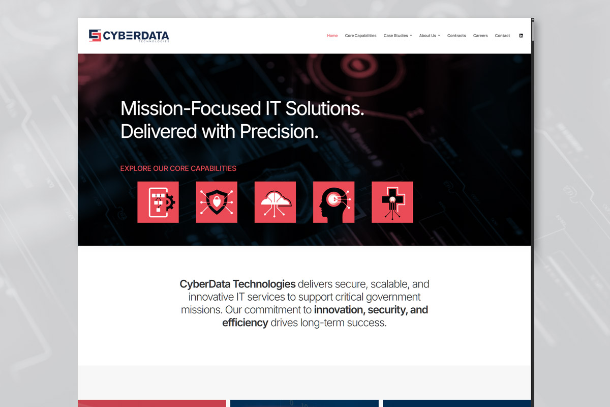
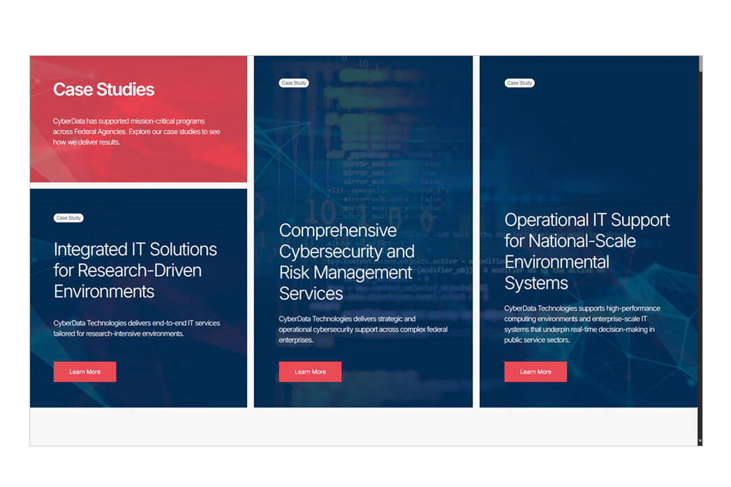
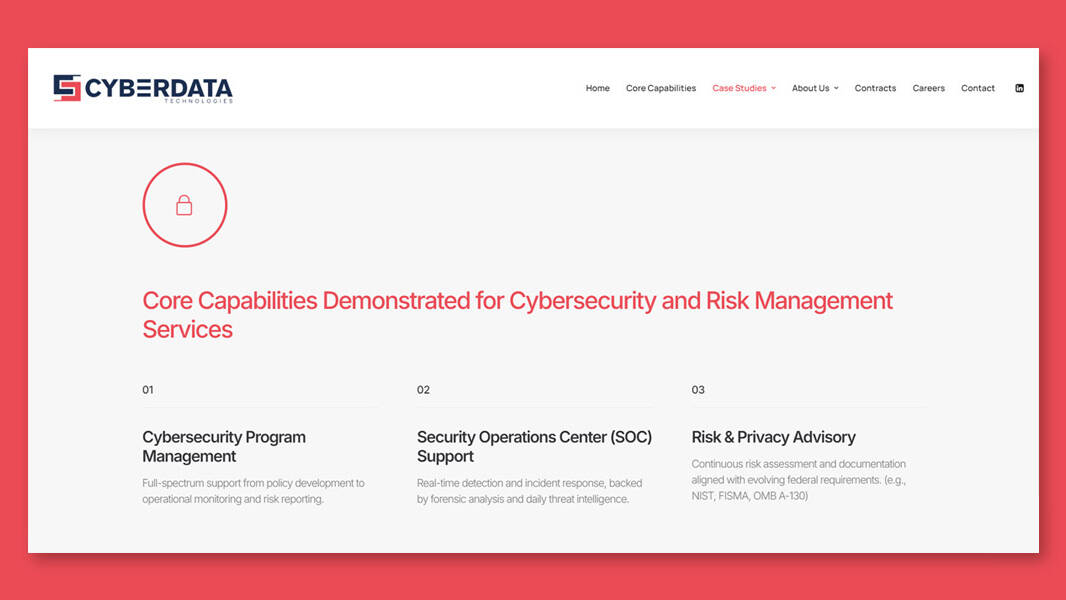
From there, we designed a site that is fast, accessible, and easy to navigate. The content is structured so complex services are simple to understand, while still speaking to highly skilled professionals in the field.
The result is a brand and website that work together to tell CyberData’s story, build trust, and invite people to connect.
Application
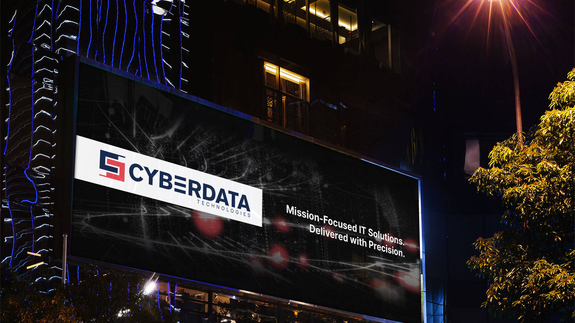
The refreshed identity introduced a more vibrant colour palette and a newly created logomark designed to complement the precision of CyberData’s IT Solutions.
Custom Icon Set
We created custom, modern icons that seamlessly tie into the core capabilities, serving as a visual accompaniment to the core categories.


