Logo Rationale: Capturing the Essence of Beer Lake Estate
The logo we developed for the property features the silhouette of a local island, showcasing windswept trees and rugged rocks, all emblematic of the Canadian Shield. Above the text, a loon gracefully swims, representing the area’s iconic wildlife. This simple and precise design encapsulates the rugged beauty and untamed vitality of Beer Lake Estate, serving as a visual invitation to explore the wilderness and the investment potential it holds.
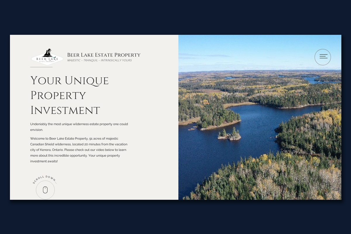
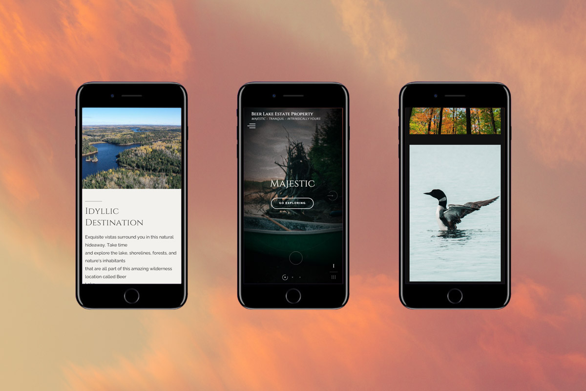
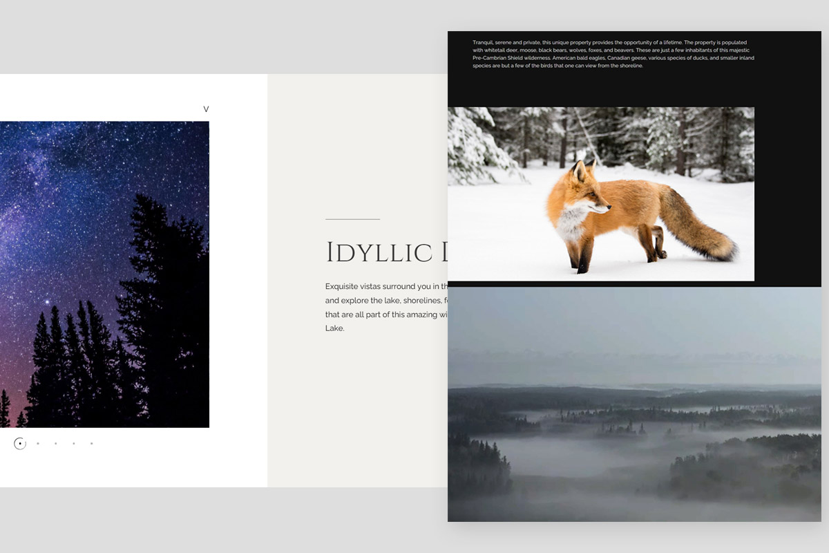
Dynamic Website Design: Our first strategic move was to design a dynamic website that acted as a virtual gateway to Beer Lake Estate Property. Through an intuitive user interface, potential investors could seamlessly navigate through the various facets of the property. The website became more than an information hub; it became a visual narrative, telling the story of Beer Lake through captivating imagery, maps, and immersive graphic elements.
Showcasing the Wilderness: The heart of the website lies in its ability to transport visitors into the wilderness. Every click opened a window to the rugged beauty of the Canadian Shield, the serene shores of Beer Lake, and the sprawling forests that defined the property. Through high-resolution images and drone footage, we transformed the website into a digital canvas, allowing investors to virtually step into the wild embrace of Beer Lake Estate.


